


.png)


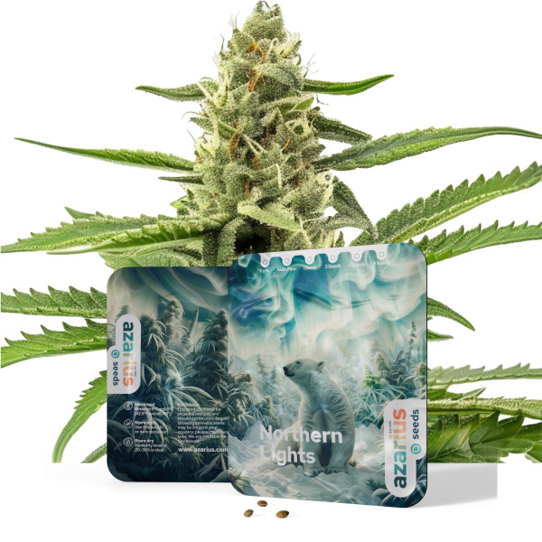
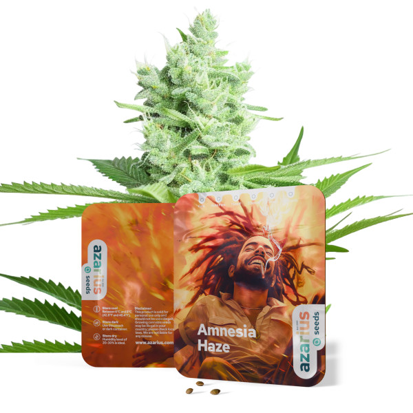
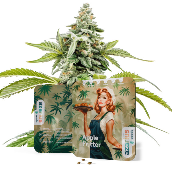
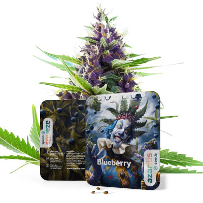
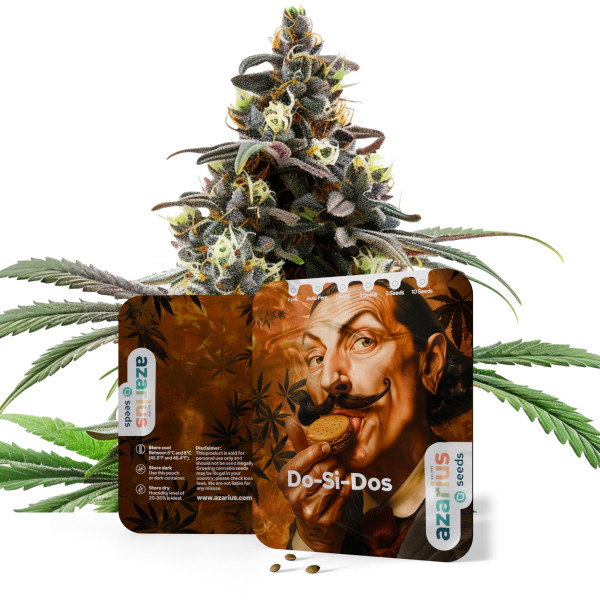
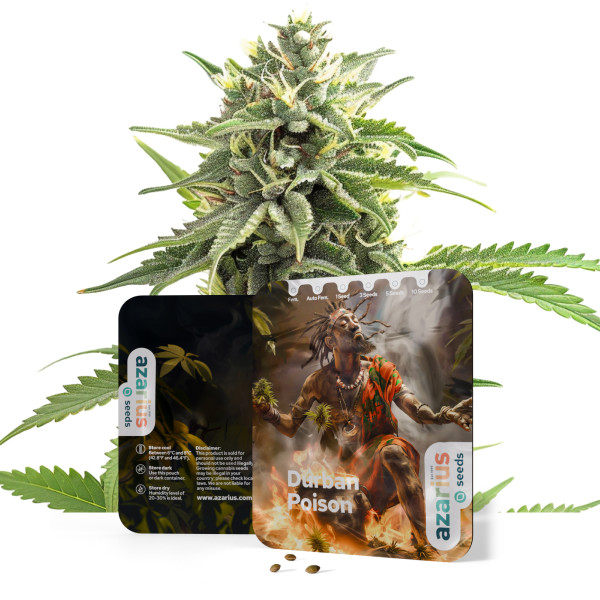
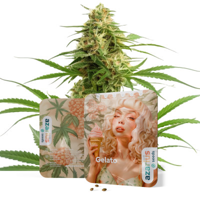
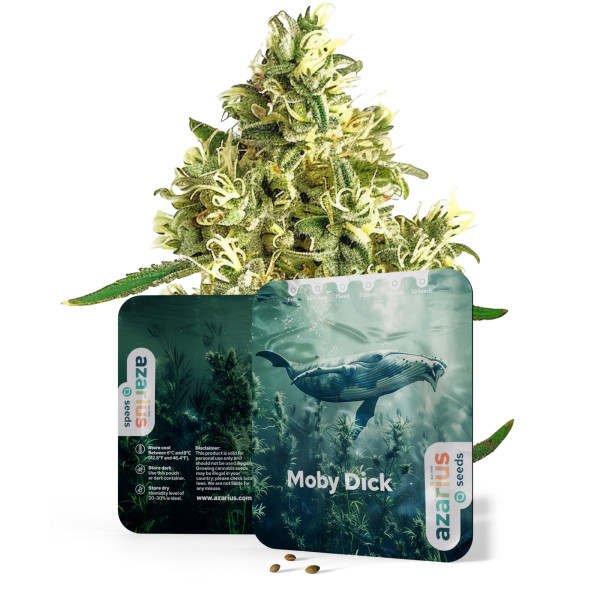
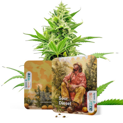
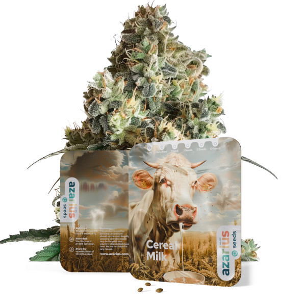
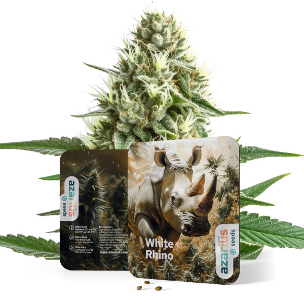
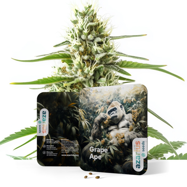
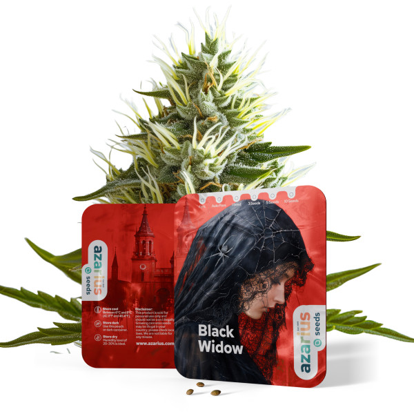
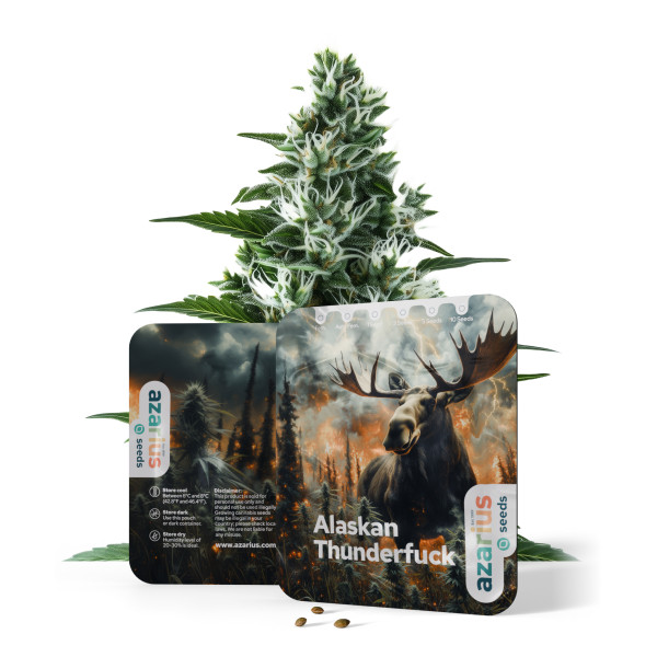
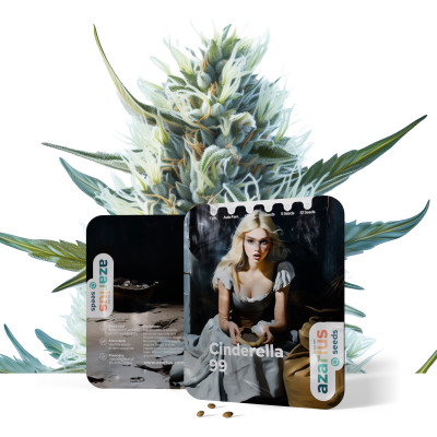
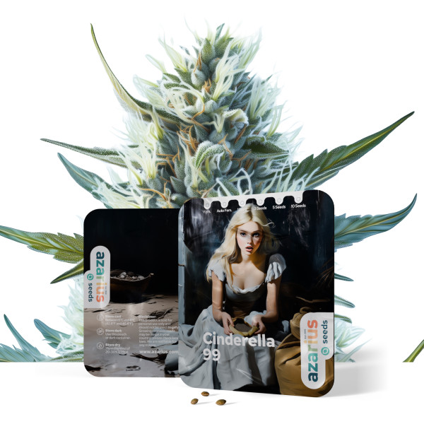
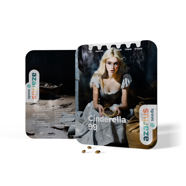
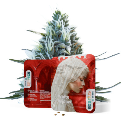
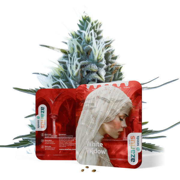
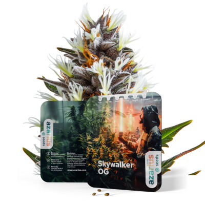
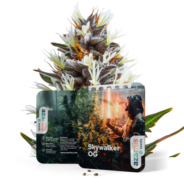
Número de semillas: 1 zł 33,41
Número de semillas: 3 zł 91,50
Número de semillas: 5 zł 130,23
Número de semillas: 10 zł 218,25

- Nuevo
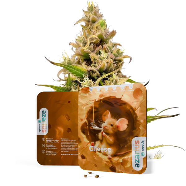
91,50 złPrecio
- Nuevo
- Nuevo
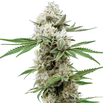
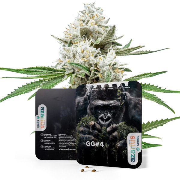
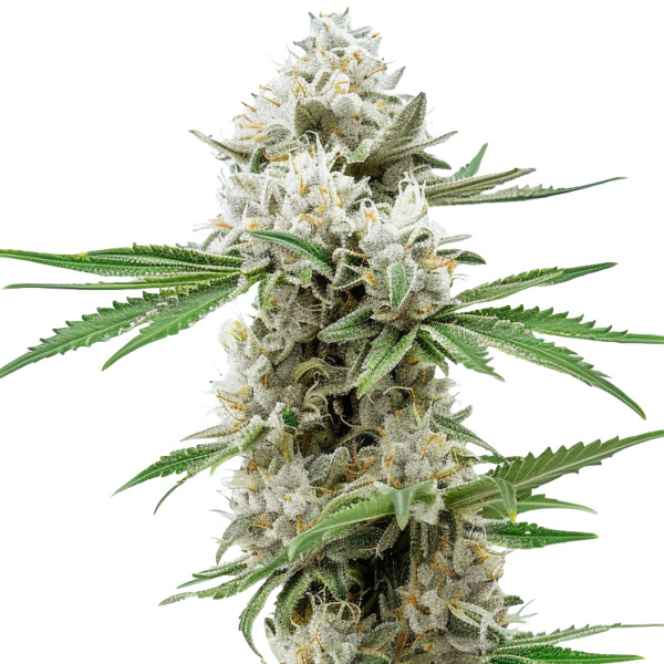
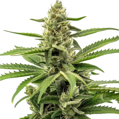
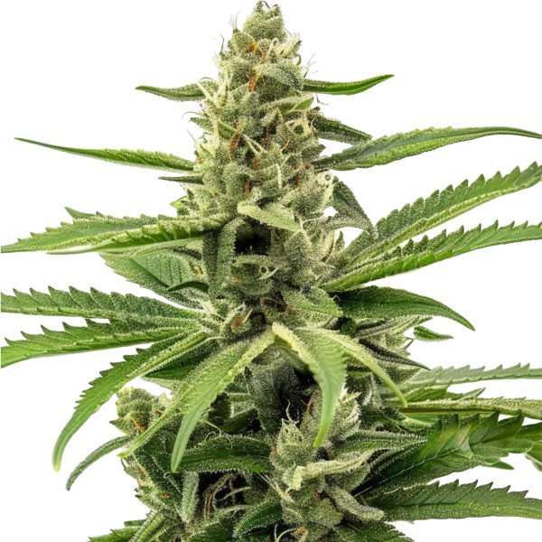
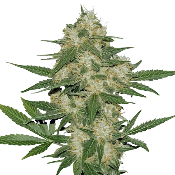
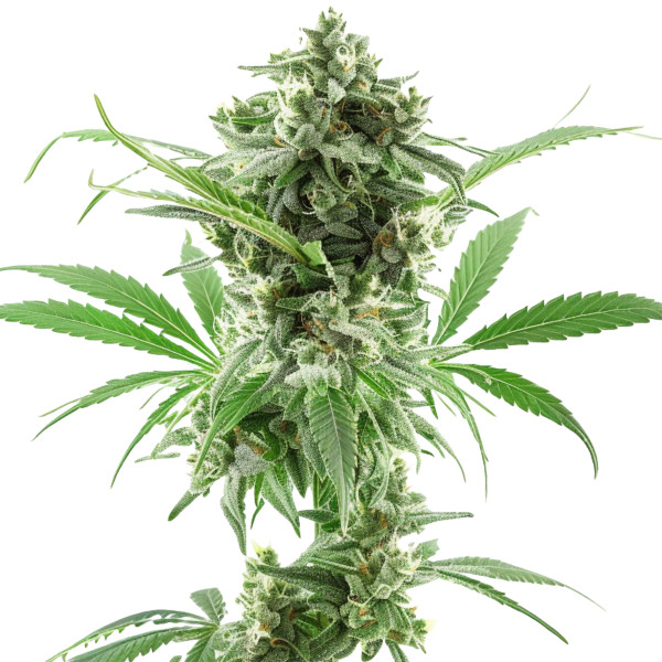
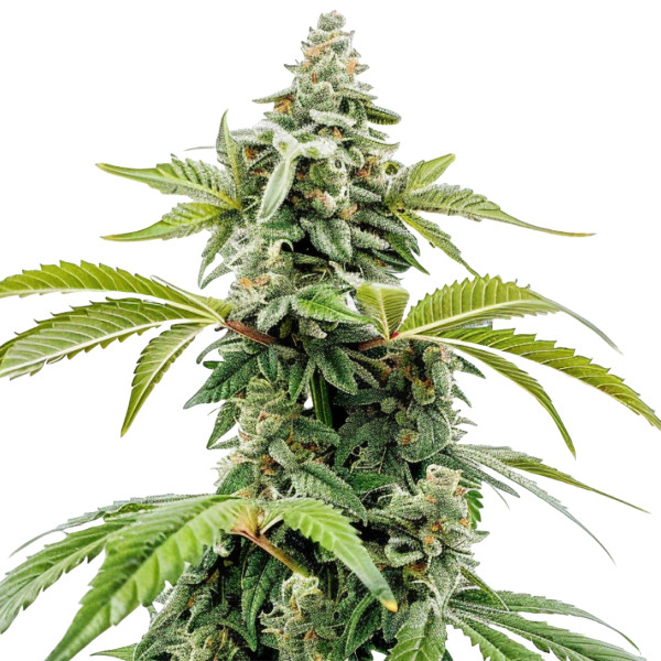
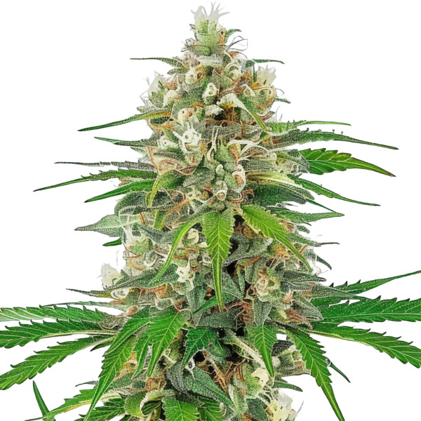
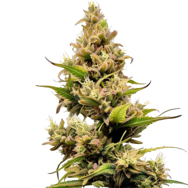
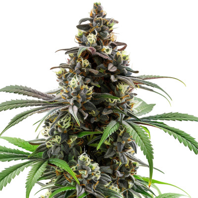
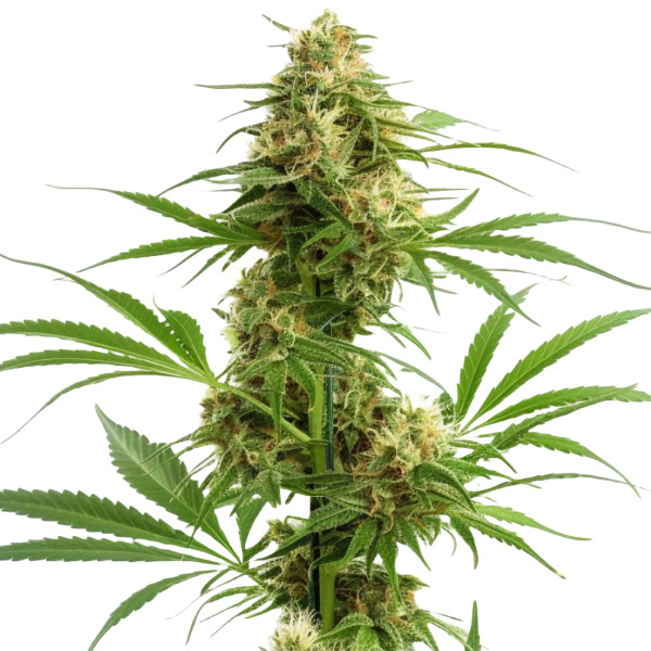
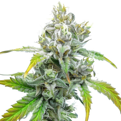
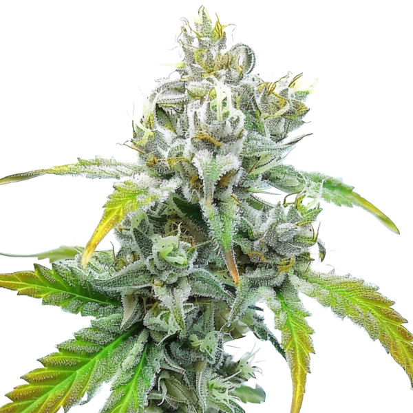
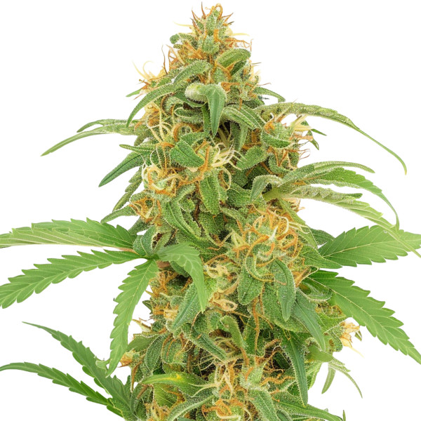
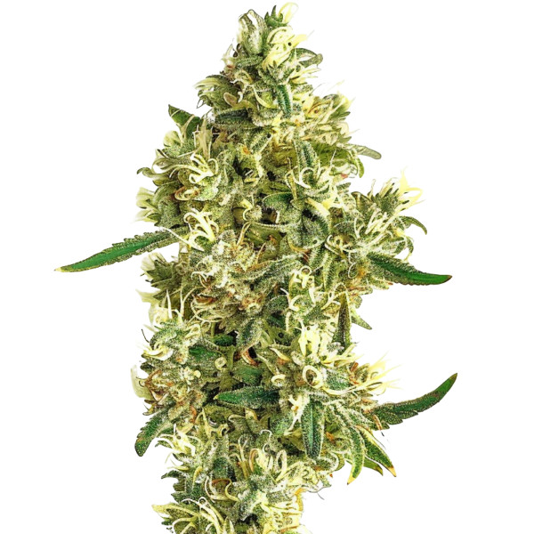
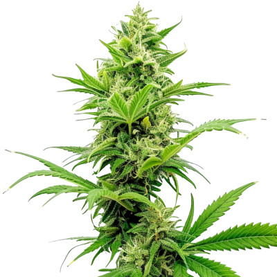
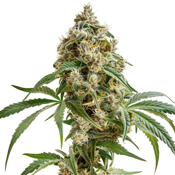
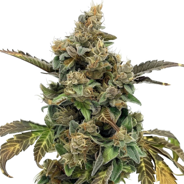
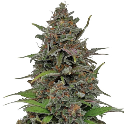
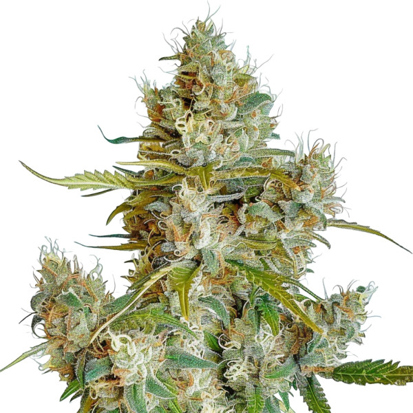
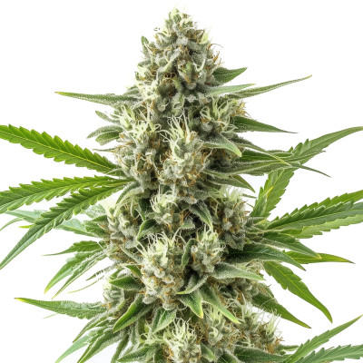
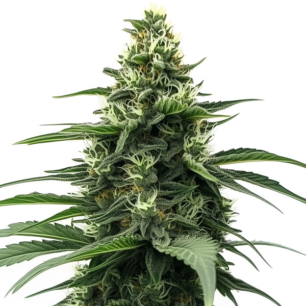
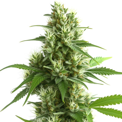
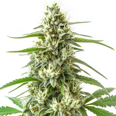
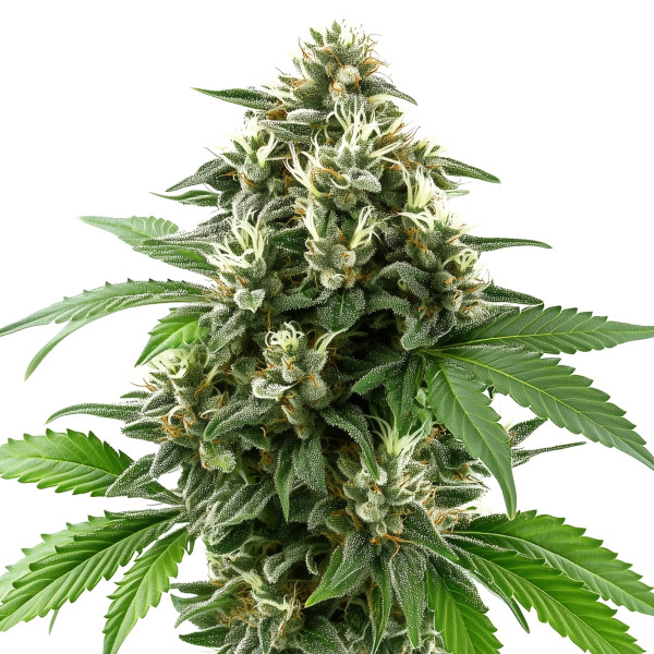
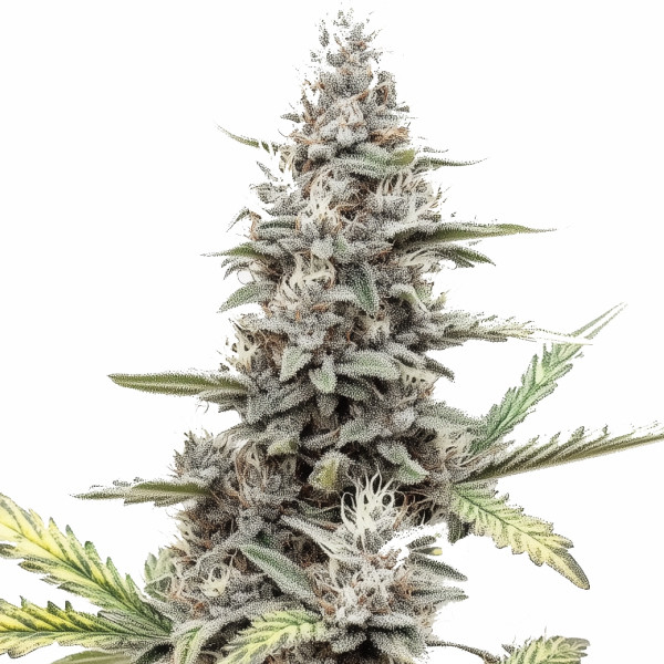
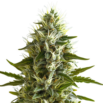
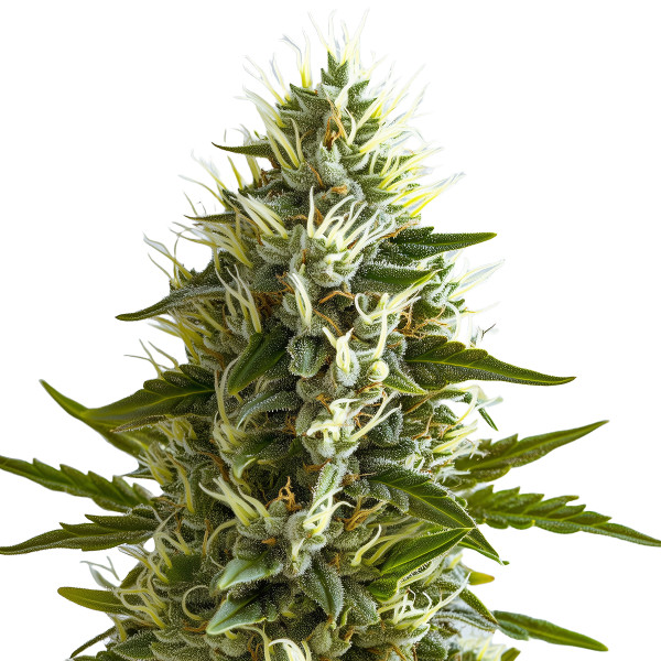
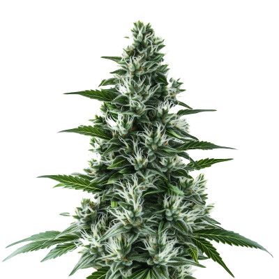
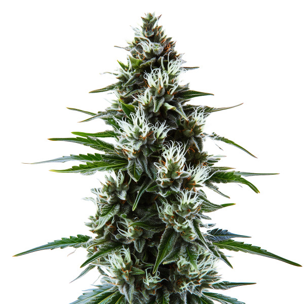
Semillas autoflorecientes
La Gorilla Glue #4 autofloreciente es un híbrido con predominancia sativa, sabores afrutados y a pino, y un subidón eufórico potenciado por un 18-24% de THC. Es eficiente de cultivar, está lista para cosechar en 8-10 semanas, y se desarrolla bien en interior o exterior.
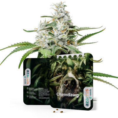
Genética:...
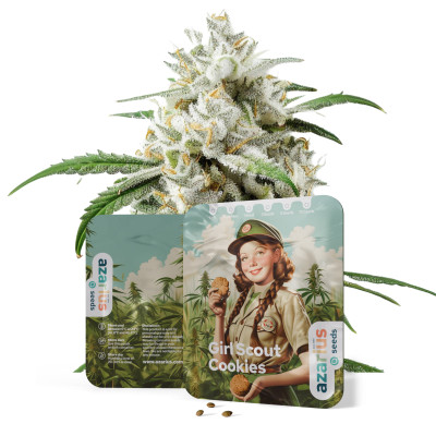
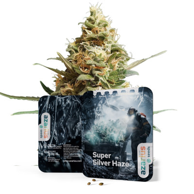
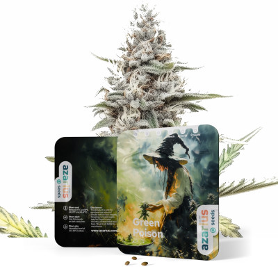
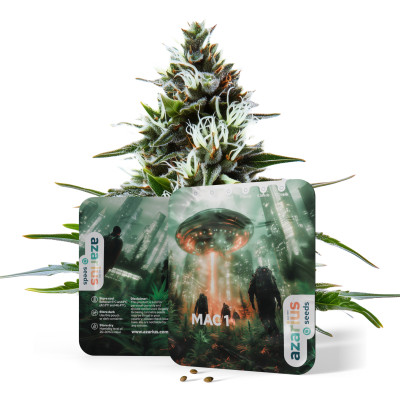
91,50 złPrecio


